


These graphic design tips are for anyone who wants cleaner, clearer and more effective work, from new designers to business owners making their own flyers. Good design is not about decoration. It is about helping people understand something quickly and feel something useful while they do.
Each tip below is simple to apply on your next project, and each one rests on principles used by professional designers worldwide.

Tip 1: Start these graphic design tips with a clear goal
Before you open any software, write one sentence about what the design must achieve. Sell a product, announce an event or explain a service. Every choice, from layout to colour, should serve that goal. Without it, designs drift towards decoration.
Tip 2: Build a visual hierarchy
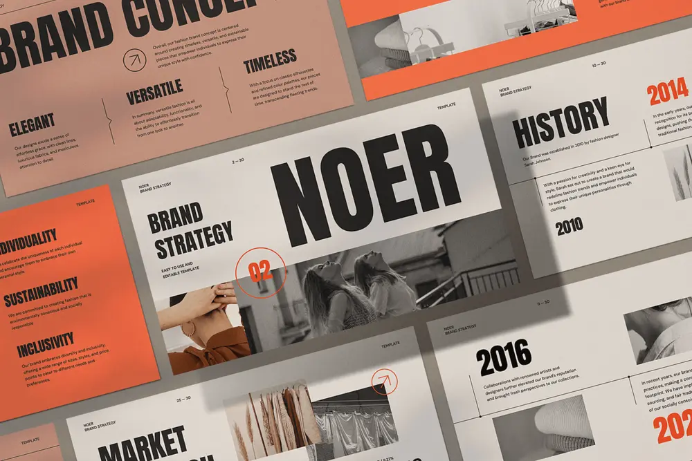
Hierarchy tells the viewer what to read first, second and third. Use size, weight, colour and position to rank information. The headline should be the largest element, supporting text smaller and details smallest. If everything shouts, nothing is heard.
Tip 3: Use white space on purpose
Empty space is not wasted space. It gives elements room to breathe and helps the eye move across the page. Crowded layouts feel cheap and tiring. Increase margins and spacing until the design feels calm, then check that important items still stand out.
Tip 4: Limit your colours
A palette of two or three main colours, plus neutrals, is usually enough. Pick one colour for emphasis and use it sparingly. Check contrast so text is readable, following the W3C accessibility guidelines for colour contrast. Our guide to what is branding explains how colour supports identity.
Tip 5: Choose fonts carefully
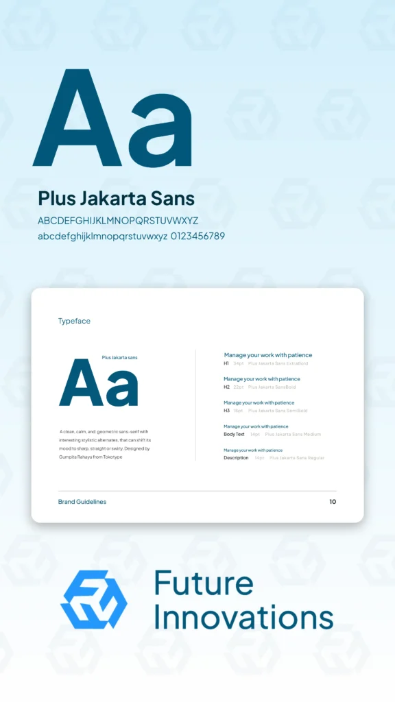
Use no more than two typefaces: one for headings and one for body text, or a single family with several weights. Choose fonts that match the mood of the brand and stay readable at small sizes. Avoid novelty fonts for long text.
Tip 6: Align everything
Alignment creates order. Use a grid so elements line up consistently. Left aligned text is usually easiest to read. Check edges, margins and the spacing between items, and fix small misalignments that make a layout look careless.
Tip 7: Be consistent across materials
Reuse the same colours, fonts, icons and spacing across flyers, social posts and your website. Consistency builds recognition and trust, and it speeds up your work because decisions are already made. A short style guide keeps everyone aligned.
Tip 8: Use quality images
Sharp, relevant images make a design feel professional. Avoid pixelated or stretched photos and generic clip art. If you cannot get original photography, choose licensed images that fit your brand and crop them thoughtfully.

Tip 9: Test and ask for feedback
Show your work to someone who matches your audience and ask what they notice first and what they think it says. If their answers differ from your goal, adjust. Organisations such as AIGA publish resources that help designers sharpen their critique skills.
Tip 10: Keep learning from the history of the craft
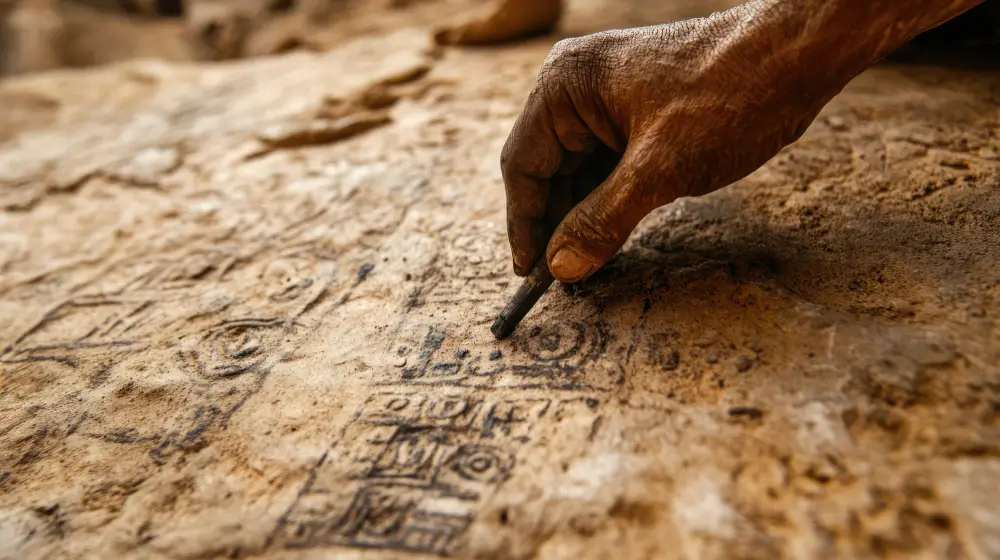
Great designers study what came before. Looking at classic posters, typography and layouts teaches principles that outlive trends. Start with our overview of the history of graphic design to see how movements shaped what we make today.
Putting these graphic design tips into a checklist
- Is the goal written and clear?
- Does the headline stand out first?
- Is there enough space around each element?
- Are colours limited and readable?
- Are there no more than two typefaces?
- Is everything aligned to a grid?
- Does it match the rest of the brand?
- Are images sharp and relevant?
- Has someone from the audience reviewed it?
Print this list and keep it near your desk. Run through it before you send any design to a client. It catches most common problems in minutes.
Common mistakes to avoid
- Using too many fonts, effects and colours at once.
- Ignoring contrast, which hurts readability and accessibility.
- Cramming every detail into one layout.
- Skipping a proof read, so typos reach print.
- Forgetting to export in the right size and format for each channel.
To see how design supports commercial results, read why graphic design for business pays off, and if you want a career path, our guide on how to advance your design career shows the next steps. You can also explore our graphic design services or contact Desiq Studio to discuss your project.
Applying graphic design tips to a real flyer
Suppose you are designing a flyer for a weekend car wash in Takoradi. The goal is simple: get people to book a slot. Start with the headline, such as “Book your weekend wash”, and make it the biggest element. Put the date, price and phone number below it in a clearly smaller size. Add one strong photo of a clean car, and give it plenty of space.
Use two brand colours, with the brighter one reserved for the phone number so it catches the eye. Align everything to the left edge, keep margins generous and test the flyer at phone size. If the phone number can be read in two seconds on a small screen, the design is working.

Tools and habits that support these graphic design tips
You do not need expensive software to practise. Free and low cost tools can handle layouts, mockups and colour checks. What matters more is the habit of finishing small projects, reviewing them against a checklist and saving examples of work you admire. Keep a folder of reference images and review it before each new brief.
Set aside one hour a week for deliberate practice. Redesign an old poster, recreate a layout you like from scratch or build a style guide for an imaginary brand. These exercises build judgement faster than passive reading, and they give you portfolio pieces to show future clients. The Smashing Magazine archive is a useful source of practical design articles when you want to go deeper.
Graphic design tips: frequently asked questions
What are the most important graphic design tips for beginners?
Start with a clear goal, build a visual hierarchy, use white space, limit colours and fonts, and align everything to a grid.
How many fonts should I use in a design?
Use two at most: one for headings and one for body text, or one family with different weights.
How can I improve my graphic design quickly?
Study good work, practise with real briefs, ask for feedback and review your designs against a simple checklist before sending them.
Do graphic design tips apply to web design too?
Yes. Hierarchy, spacing, contrast and consistency shape websites as much as posters and logos.


0 Comments