
Future Innovations Corp.
A brand identity built from the ground up, ready to scale before the company even launched.
The challenge
A company about to launch, with no face to show.
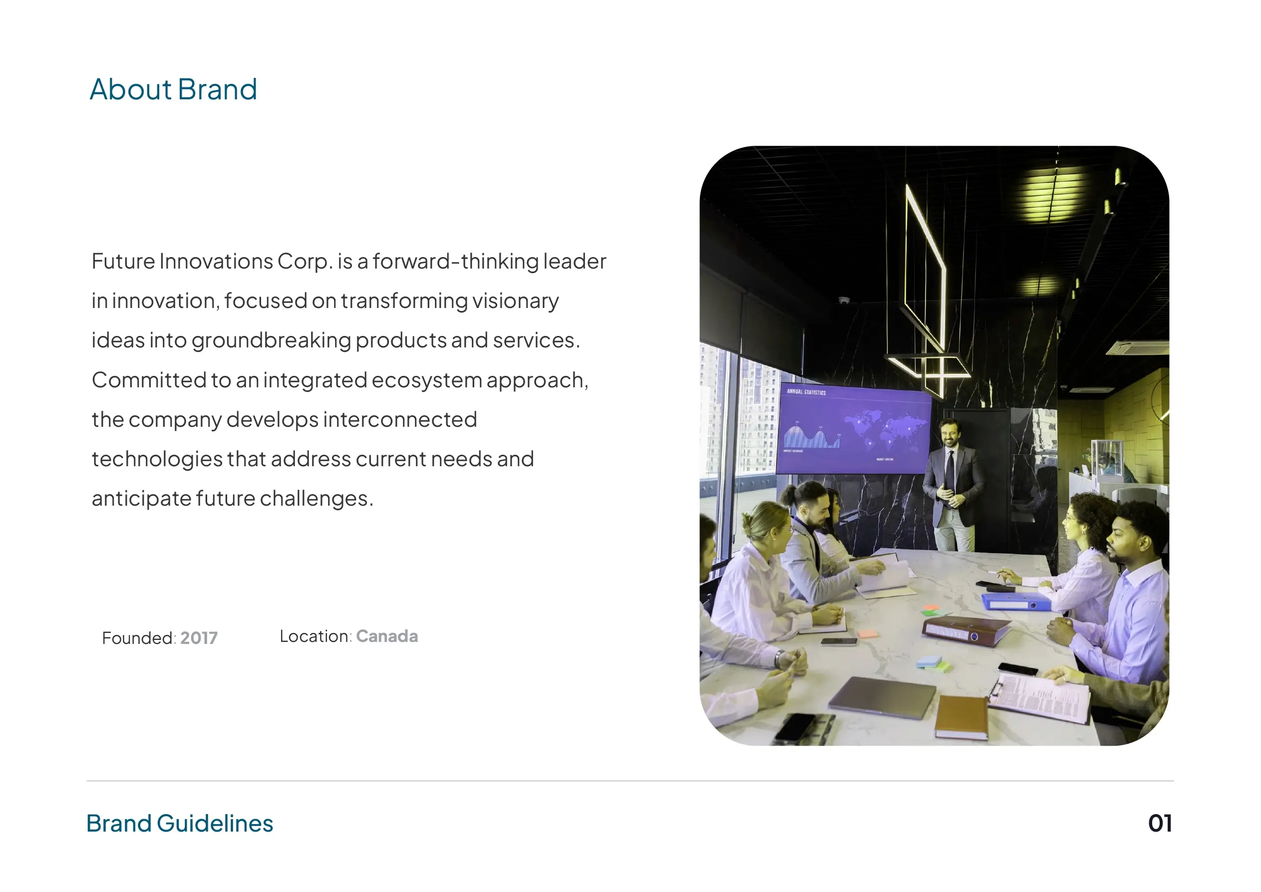
Future Innovations Corp. is a Canadian company built to turn visionary ideas into real products. What it did not yet have was an identity. Launching takes more than a logo. It takes a coherent system that earns trust from the first impression and sets the company apart before anyone has used a thing it makes.
FIC needed a complete brand: a distinctive presence, a look that reads as innovative and credible, and clear standards so it stays consistent across print, digital and everything that comes next. The brief was to represent the company confidently today, and leave room to grow into.
Strategy
Innovate today, inspire tomorrow. A forward-thinking technology brand built to lead, not follow.
- Audience
- Partners, customers and talent evaluating a new innovation company, deciding in seconds whether it looks like one they can trust.
- Personality
- Forward-focused, credible, ambitious, precise.
Future-focused
The identity had to feel ahead of the curve, because anticipating what is next is the company’s whole premise.
Built on values
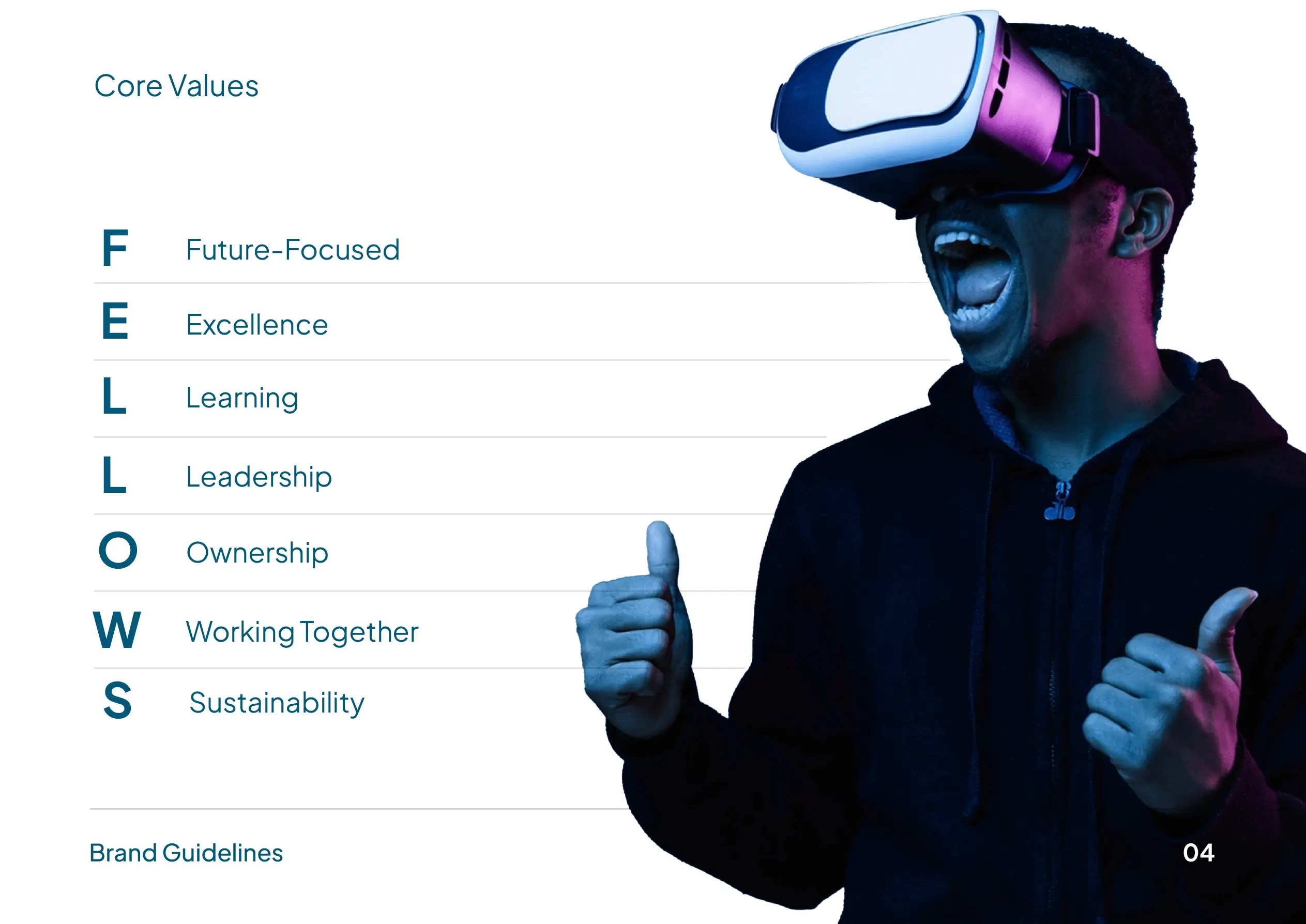
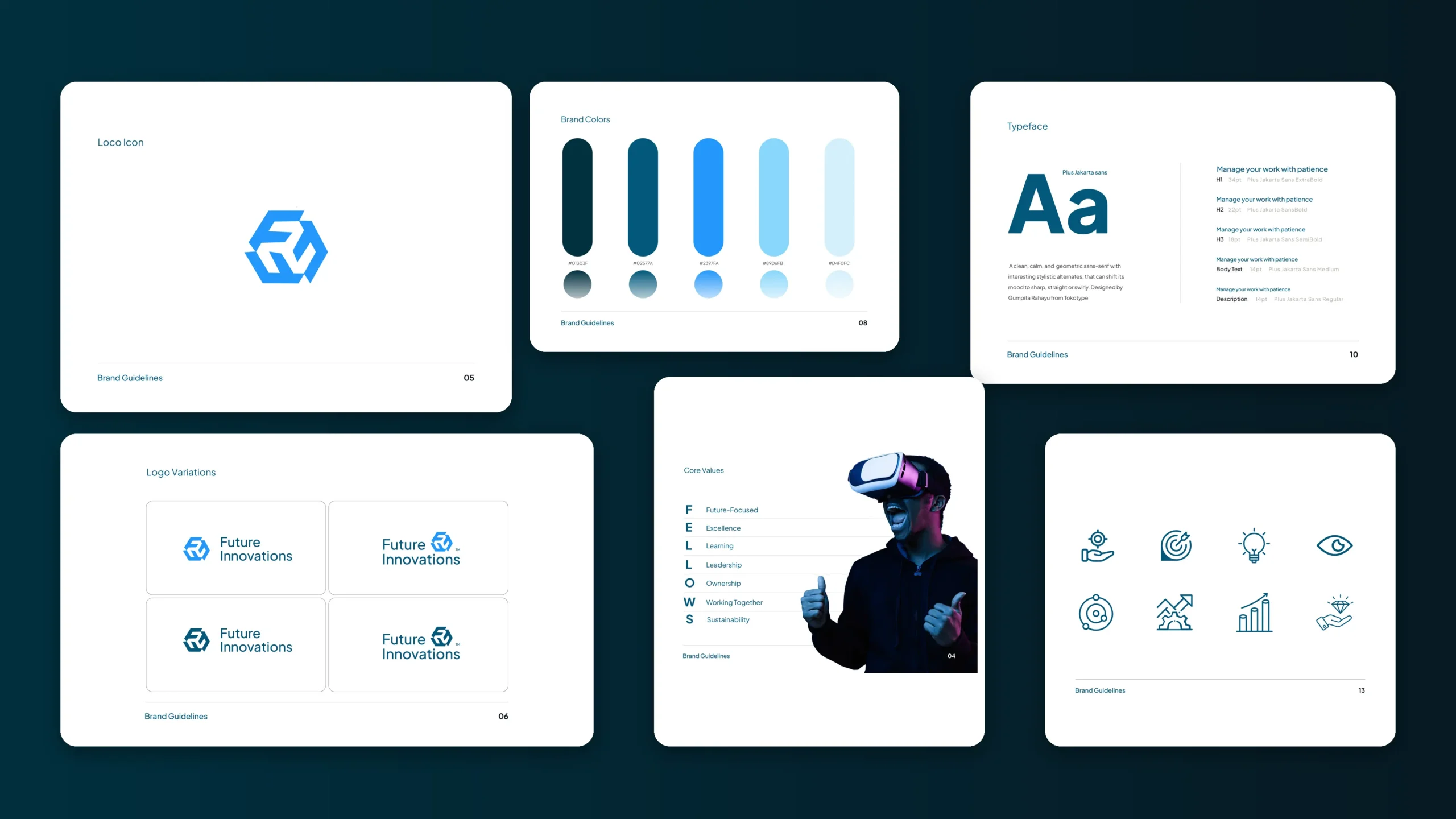
FELLOWS gave the brand its backbone: Future-focused, Excellence, Learning, Leadership, Ownership, Working Together, Sustainability. The design carries them, it does not decorate them.
Made to scale
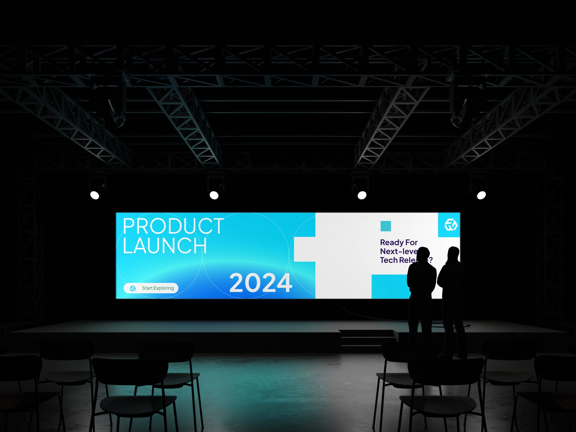
Every decision was made so the brand holds up from a business card to a product launch, and stays recognisable as the company grows.
The approach
We built the brand from the ground up, strategy first. Working with the client, we set the vision, mission, values and positioning, then let that foundation drive every creative choice, so the identity says what the company actually stands for.
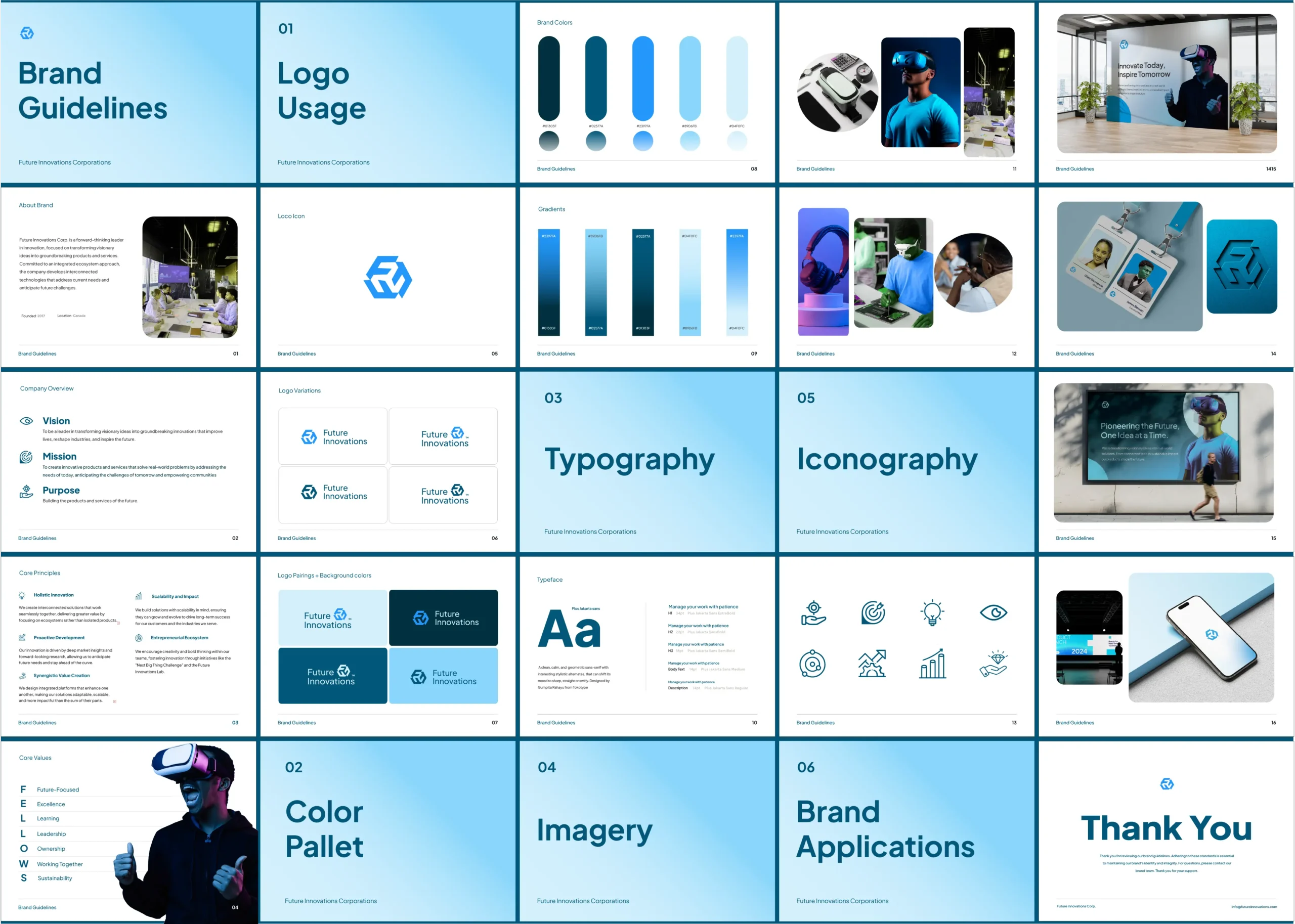
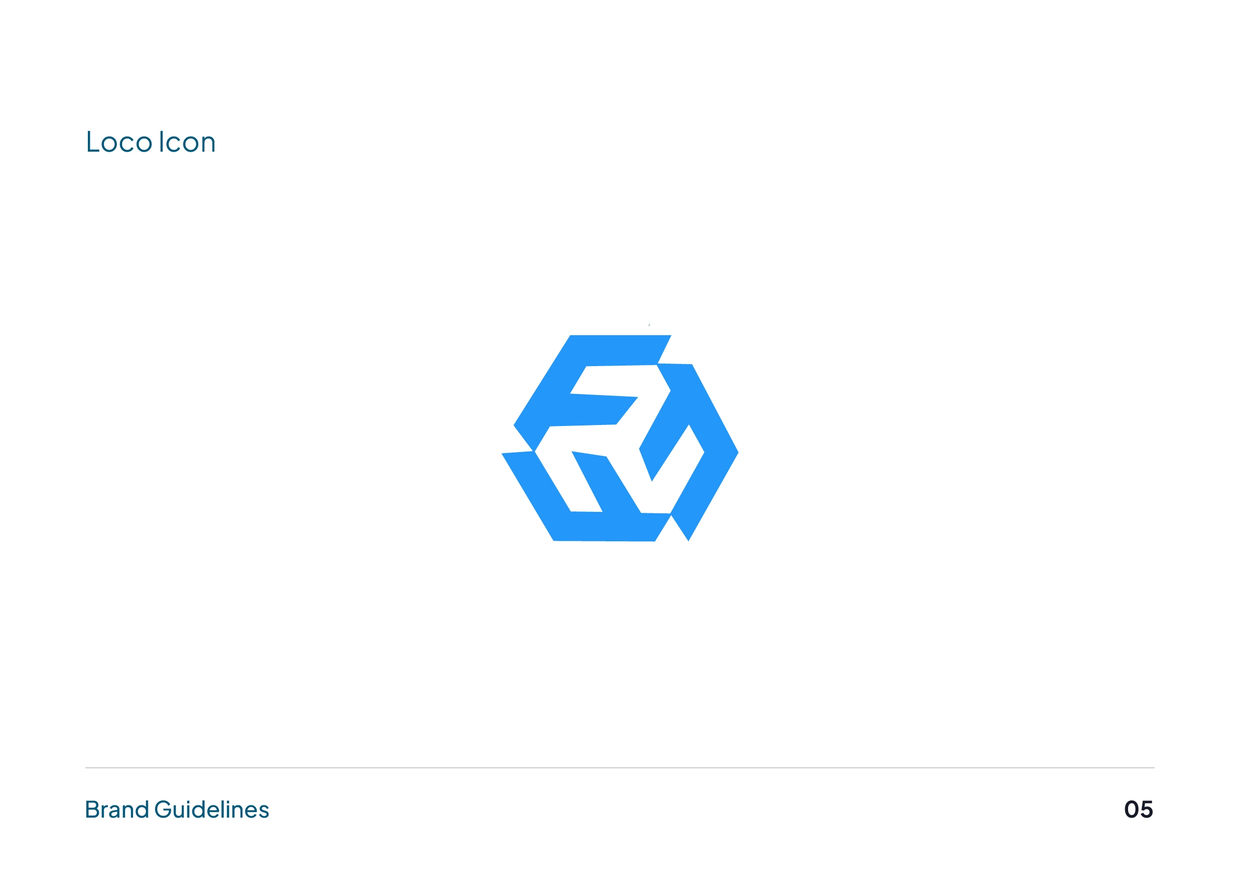
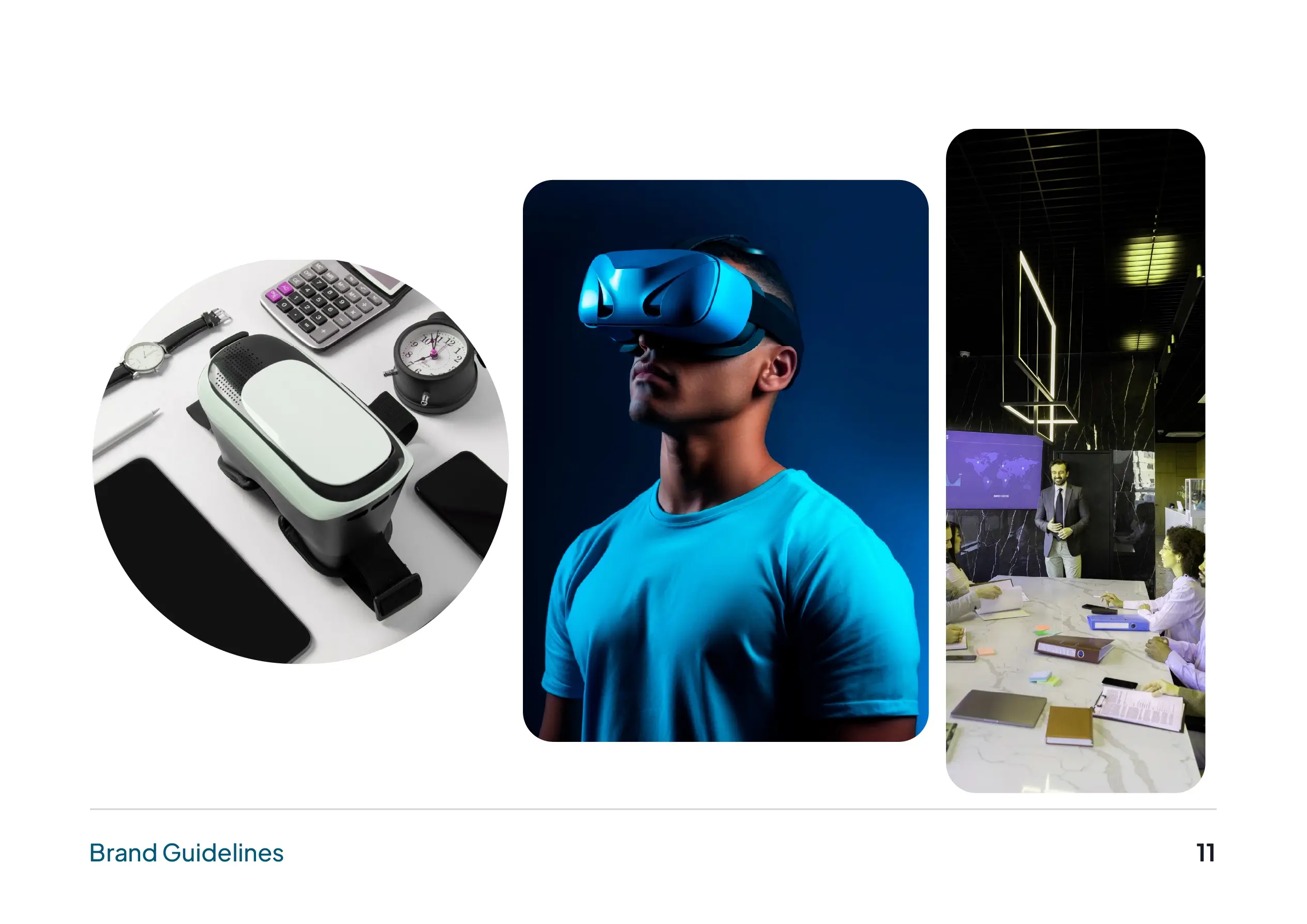
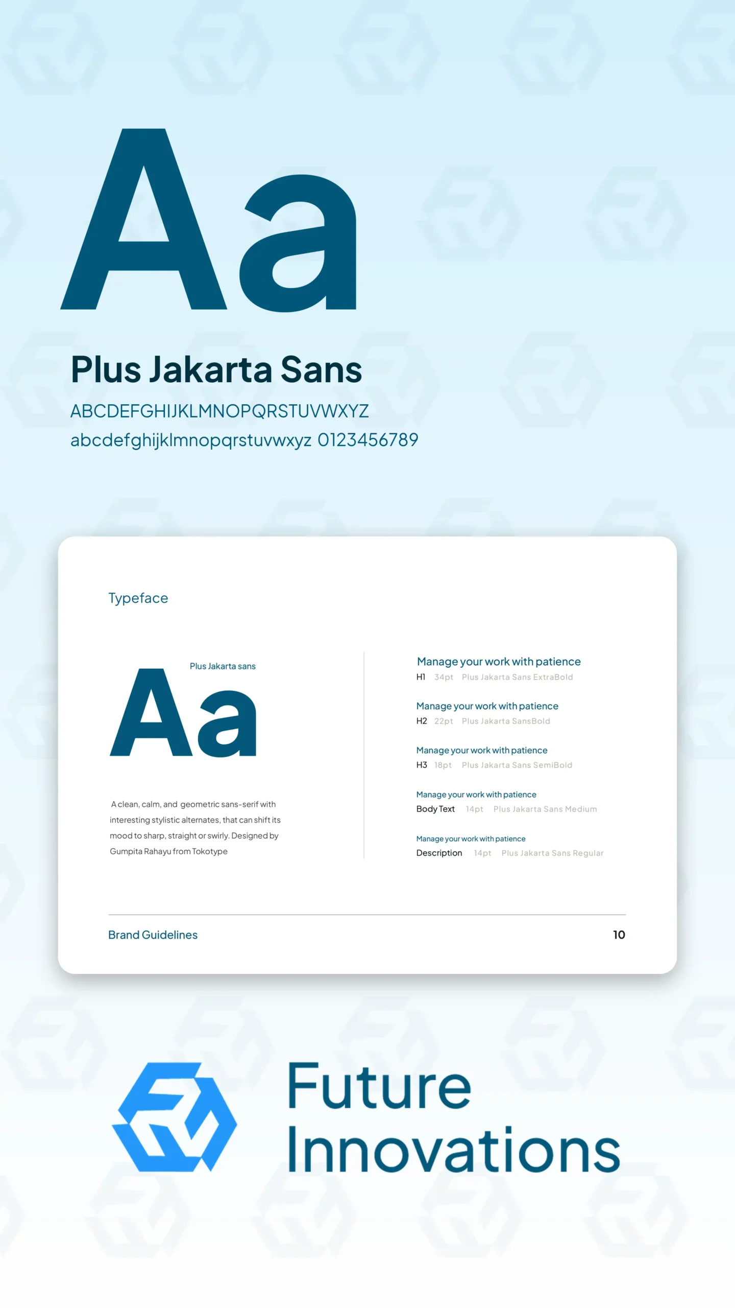
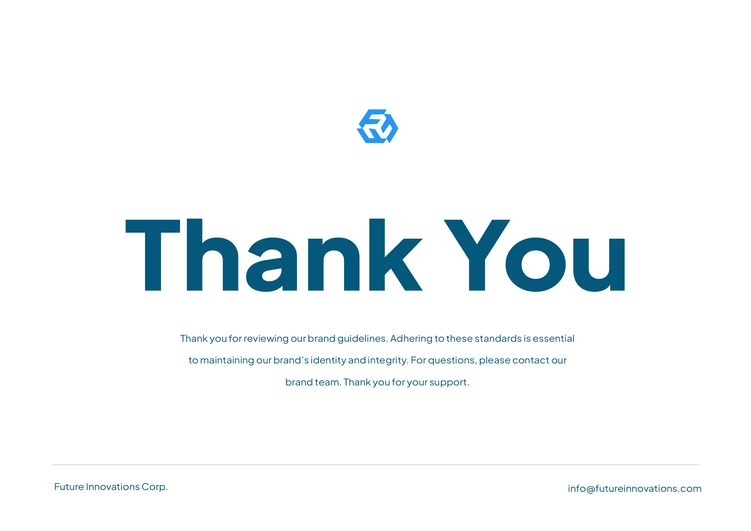
From there came the logo and the full visual language: a hexagonal mark engineered to hold up anywhere, a considered colour system, a clear type hierarchy, custom icons and imagery direction. Then the standards to protect it all, so the brand stays itself no matter who applies it next.
Strategy before pixels
Vision, mission, values and positioning came first, so the identity reflects the company rather than a passing trend.
A mark that travels
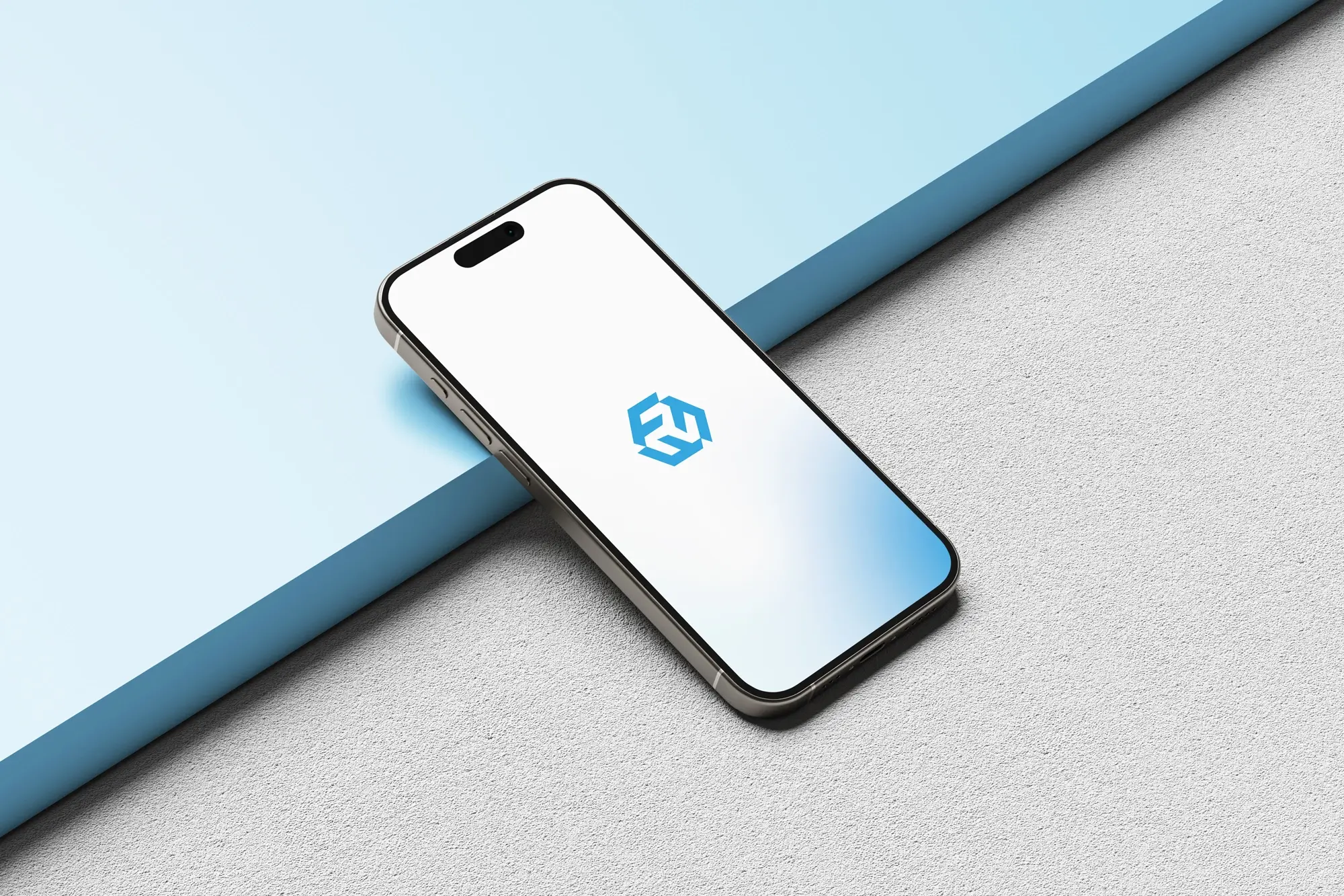
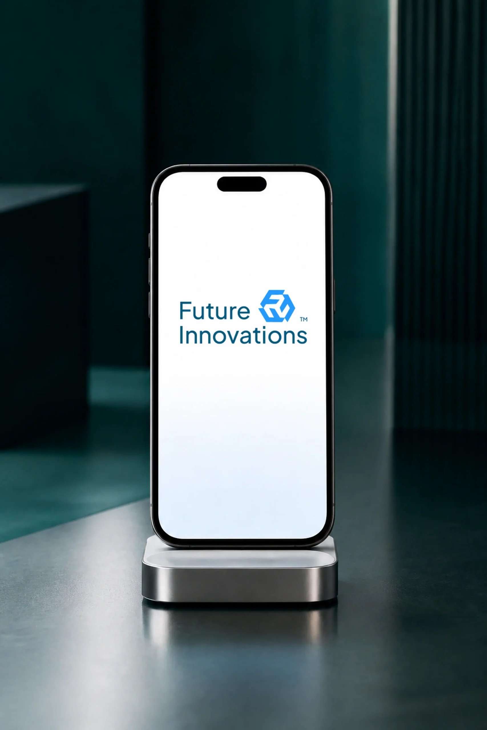
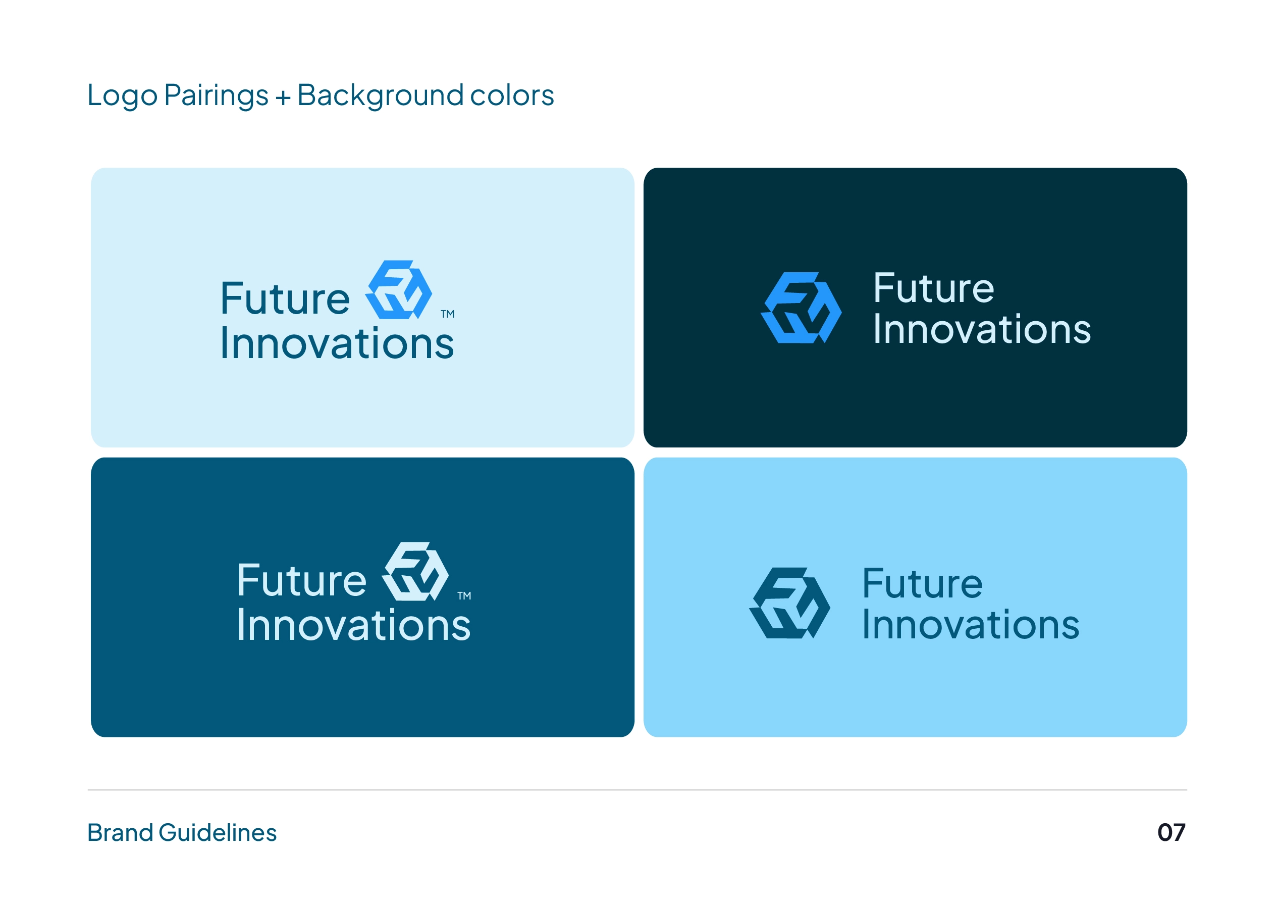
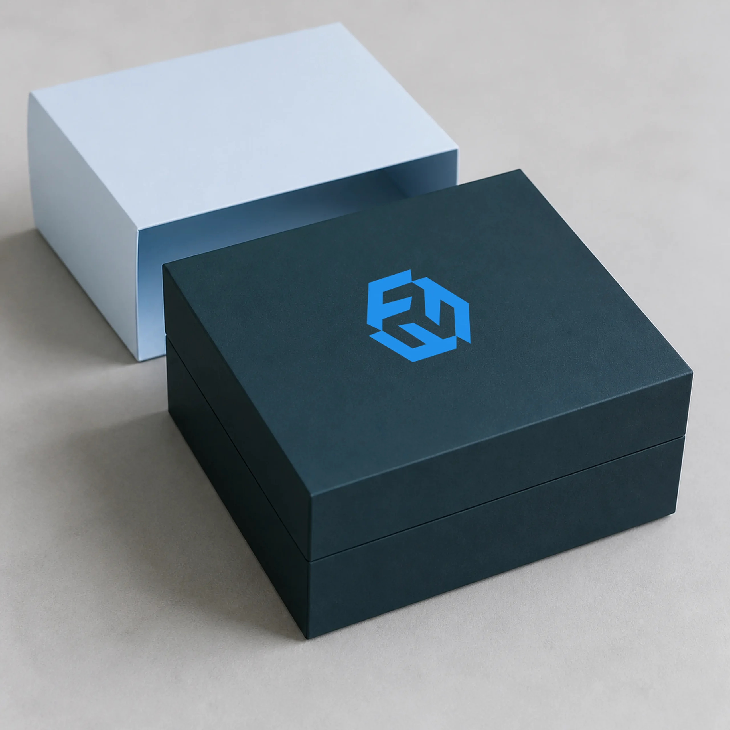
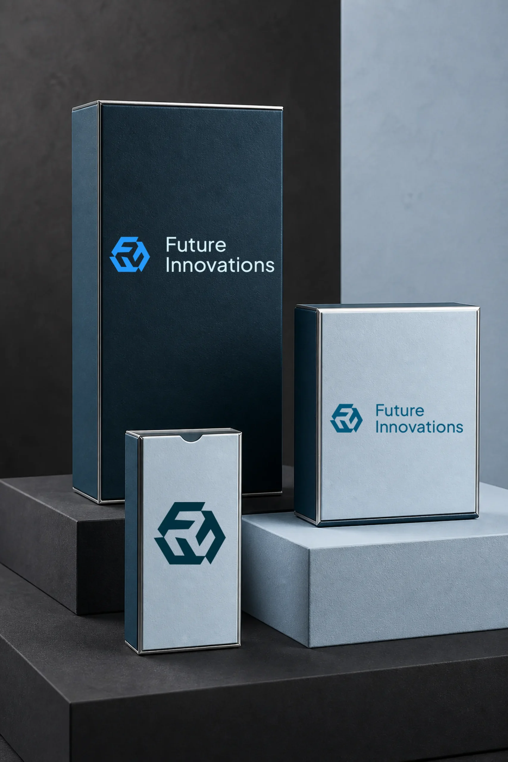
A geometric hexagon logo with primary, secondary and icon lockups, in light and dark, print-ready and digital. Recognisable at any size.
A full visual language
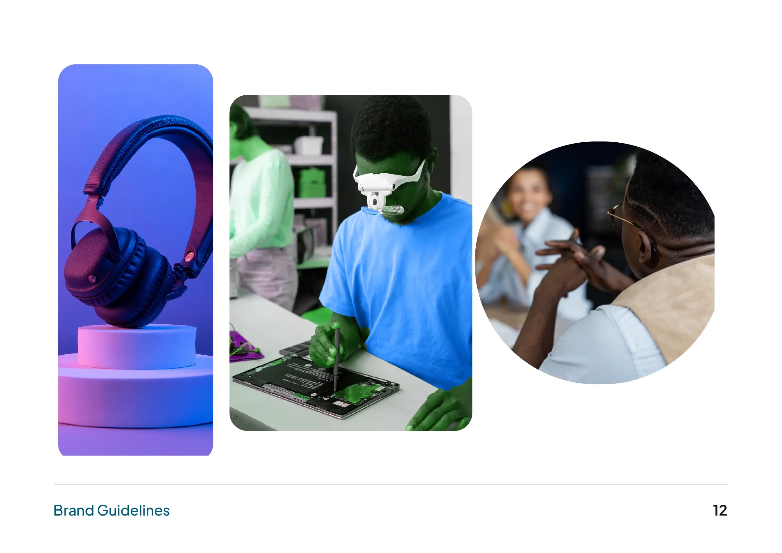
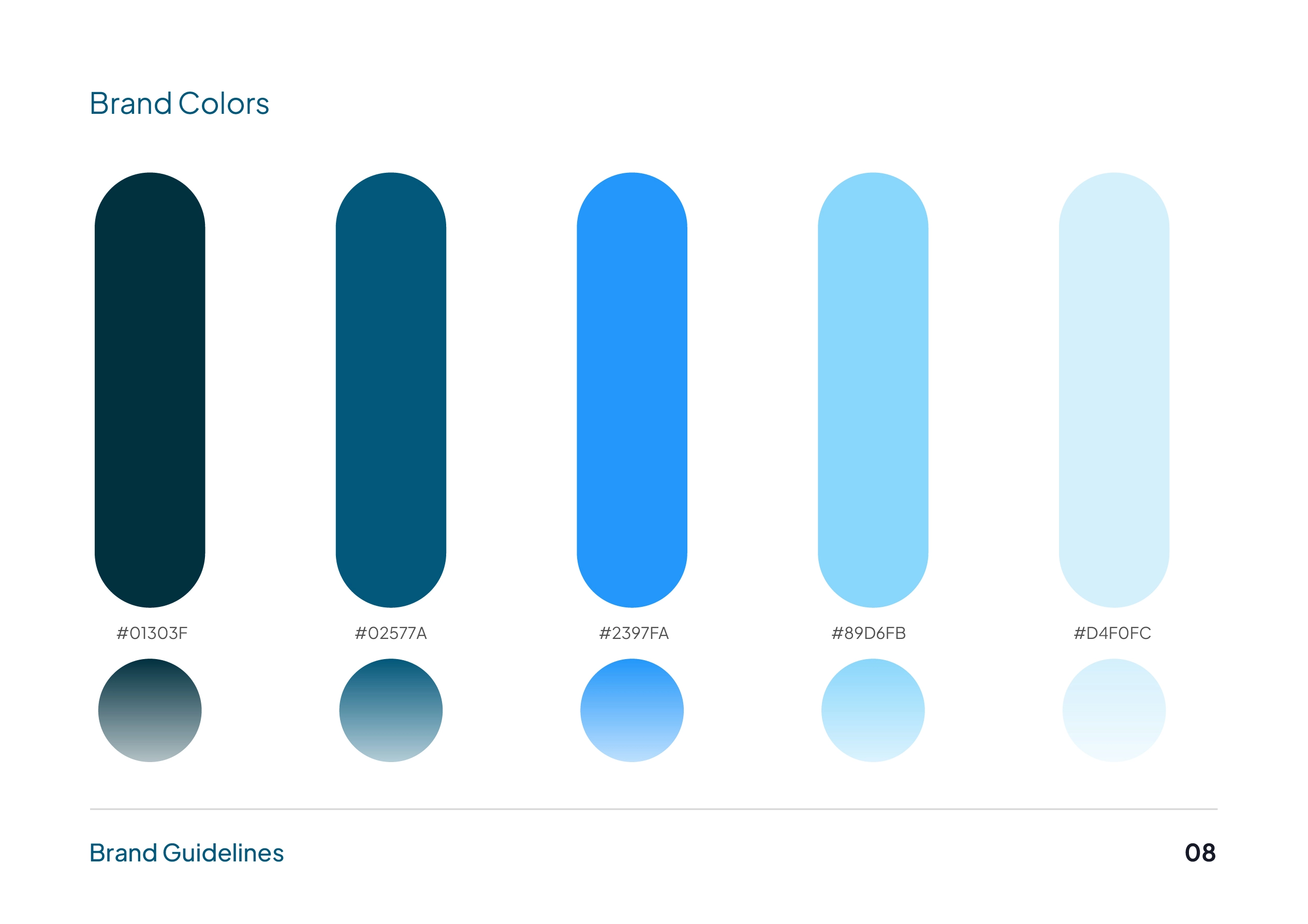
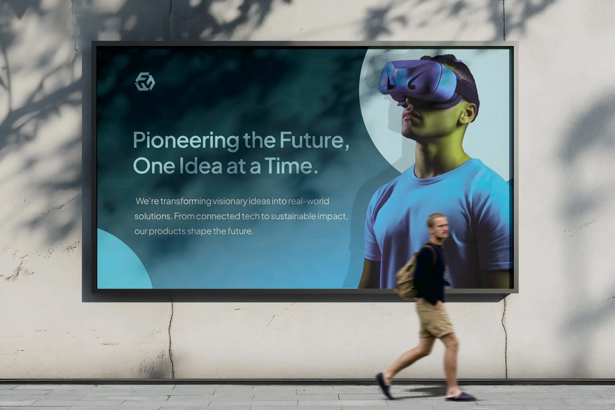
Colour, gradients, type hierarchy, custom iconography and imagery direction, working as one system across every touchpoint.
Standards that hold
A complete brand guidelines document, so internal teams and future partners keep the identity consistent as the company grows.
The system
What we delivered
- Logo system
- Light & dark lockups · print & digital files
- Color palette & gradient system
- Typography
- Custom iconography
- Imagery direction
- Graphic elements
- Brand guidelines
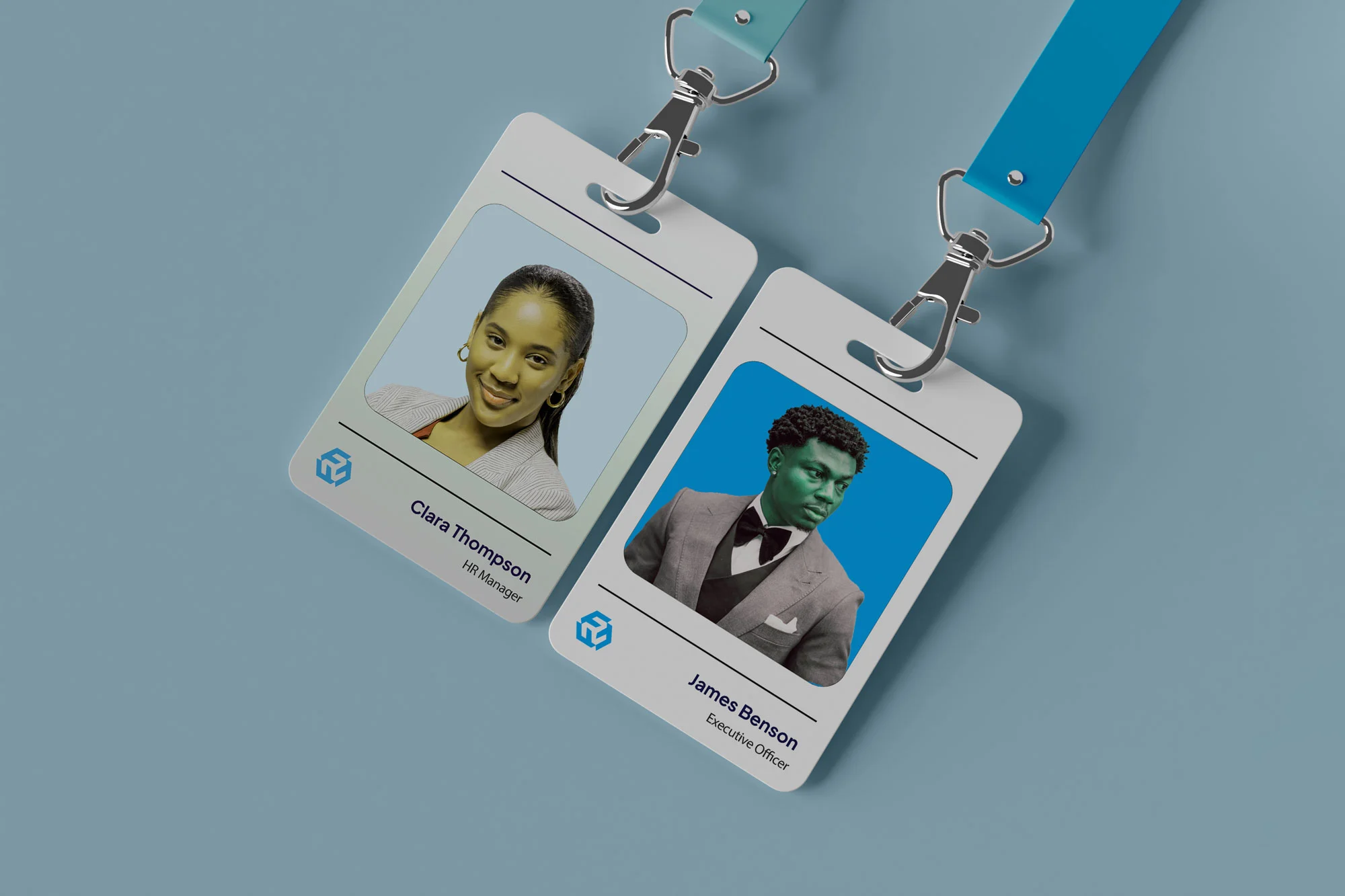
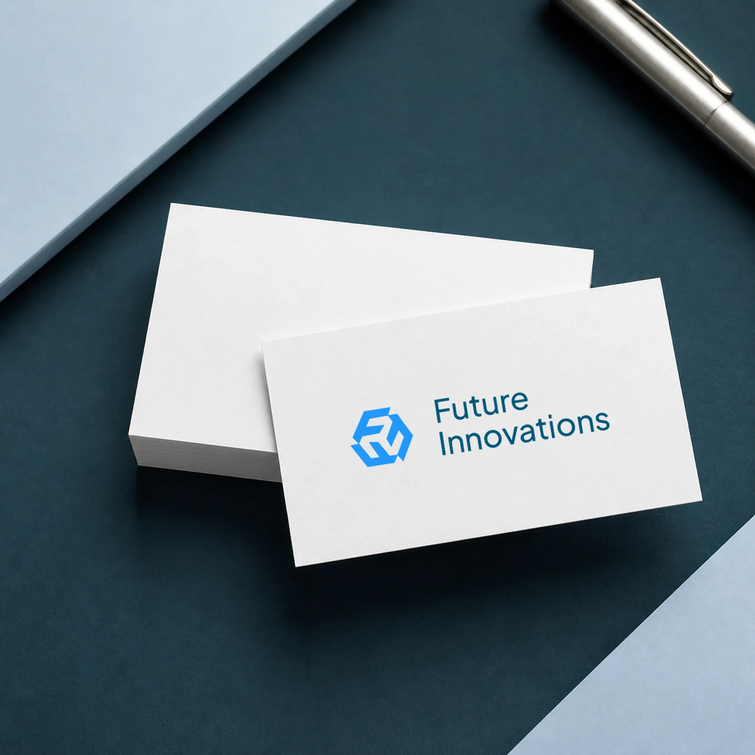
- Stationeries
- Social flyers
- presentation templates
The work

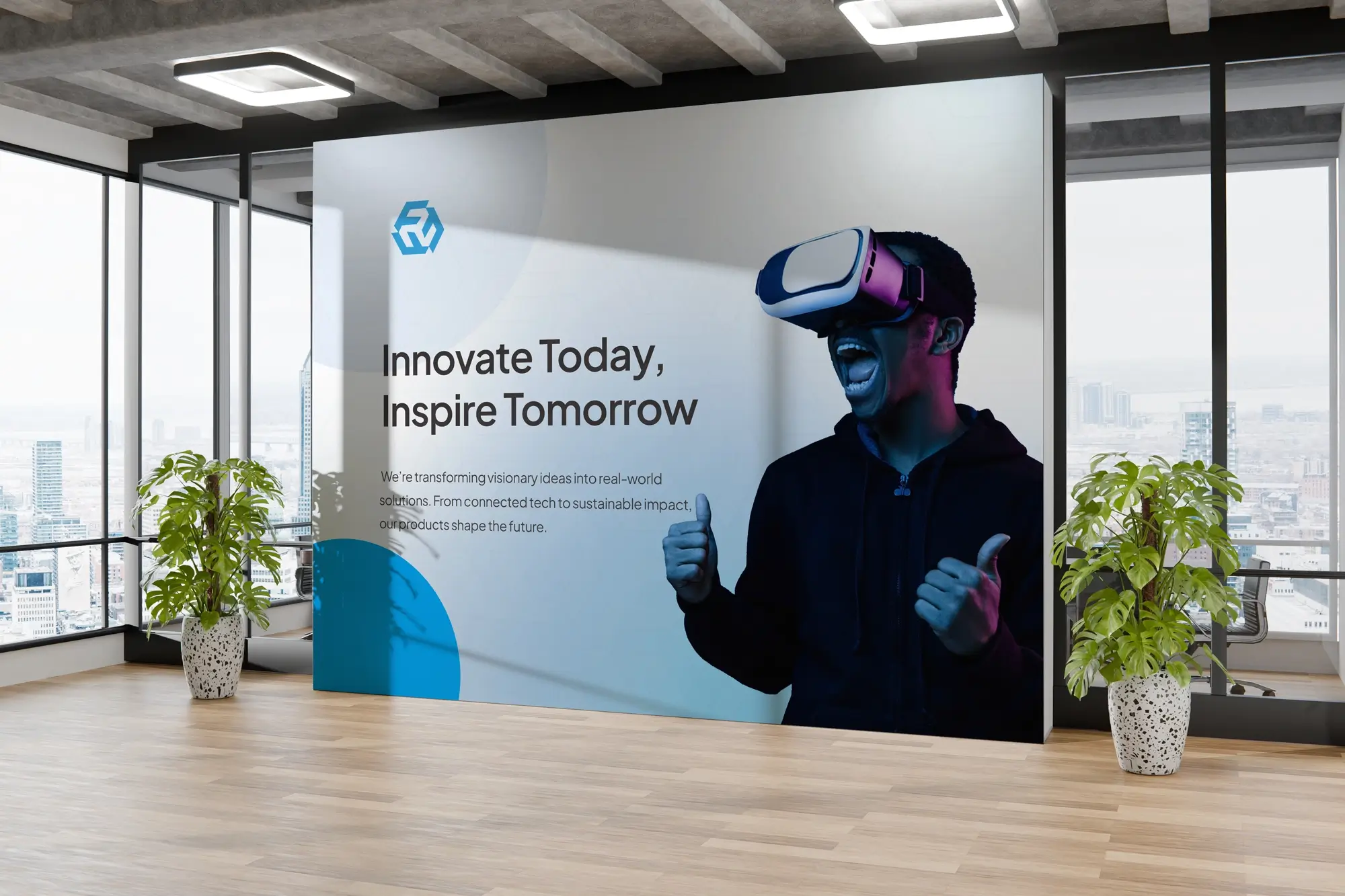
Desiq didn't just design us a logo, they gave us an identity we're proud to put our name on. Every touchpoint finally feels like us.

Related projects
Most projects like this one begin with a strategy engagement.